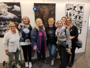
We are pleased to announce the inauguration of the quilt show of works by Quiltimprovstudio, in the exhibit room of Bottega Kocai, Via del Santo 16, Padova (Italy), next March 8th 2025, at 16.30.
Kocai has been created by 6 artisans wishing to share their art and craft, in an unique space dedicated to originality and authenticity: a place to meet artisans, to hear their stories, to take time for understanding, touching, choosing with awareness. In a time when speed and immediacy may create difficulties in communication, Kocai is intended as a welcoming place, to breathe projects, time, happy accidents and solutions.
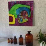
This place provided the perfect atmosphere for hosting the most recent project by Quiltimprovstudio.
Quiltimprovstudio was born as a fully online project during the pandemic, to connect with others sharing the same passion for learning the improv type of modern patchwork.
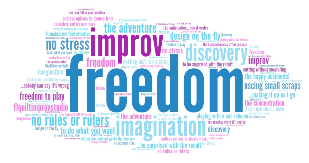
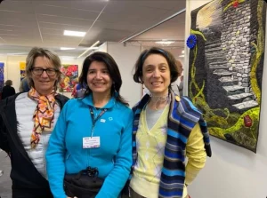
During the year 2023 we started to translate into real life what, for three years, happened only online. A series of meetings face to face have been arranged with quilters that joined us accepting the challenge both individual and collective of trying something new in the improv patchwork field, which for some was totally new (a discovery, an exploration) and for others something already tried in the past while connecting online, but for the first time it became experienced also in group and in person. It is not a surprise that the digital and the real-life timing are different: it was an occasion to return to slowness, observation, look and feel that enriches real relationships, in person.
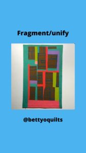
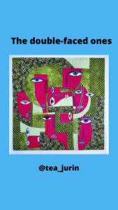
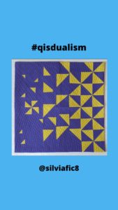
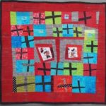
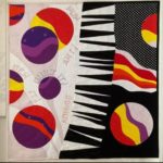
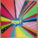
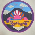
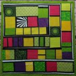
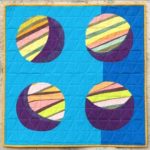
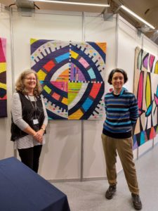
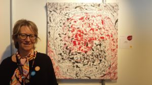
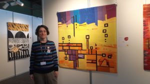
The works part of the gallery in the Kocai exhibit room are the result of this series of retreats. Two themes came out: “Green Spring improv” and “Winter scents improv”.

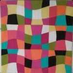
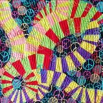
The group of works was based on an exact palette that all the participants shared, chosen among the colors of the winter sky and the delicious tastes that characterize winter food traditions. In the show you will also find the first quilts made by Paola and Giovanna, as a game among them, using the same palette (at that time, with Kona cotton “enchanted” color of the year), just before the pandemic arrived and Quiltimprovstudio online version was created together with Carla, and the games started to be open to all.
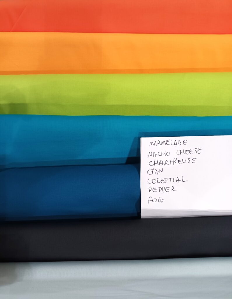
Now, we are making a transformation from digital to in-person version of Quiltimprovstudio. You can find, in the picture below, the list of Kona cotton solids color used for making quilt banners sized 30x70cm (12 x 28 inches).
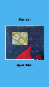
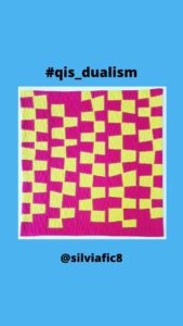
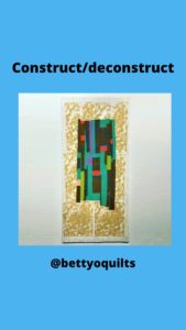
We invite you to pay attention, starting from the inauguration date, to the Instagram profile @quiltimprovstudio, where you will see the works resulting from these retreats and which are part of the in-person gallery show at Kocai. You are invited to come to Padova, Italy, and visit the show, which will be open until March 29th.