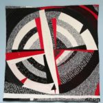
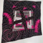
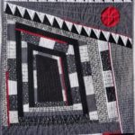
“Energia circolare” by @mari.quilt
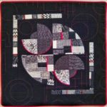
“Pink meets Black and White” by @maria_dlugosch
We have now reached the final part of our improv game based on the use of black and white, and we have asked the participants of our game who have recently published their completed work, if they felt that working in black and white has been different from working with other colors, and why.
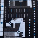
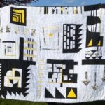
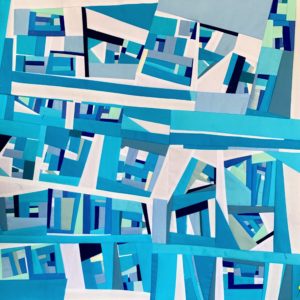
Cityscape” by @alsterdeeluxe
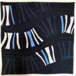
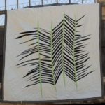
“Let it flow” by @sakura.quilting
The first reply we received was the one by @emmafassio, who wrote: “I think that composing with black and white is different than doing this with other colors, because their contrast is strong and we often perceive them as opposites, also when linking them to emotions and sensations. Wearing a white dress has a different meaning than wearing a black one. Colors are perceived differently in different cultures, and this is a fascinating theme to be explored. Strong contrasts may induce reverence and fear: thus working on this project has been a stimulus to face ideas and prejudices I may have on the meaning of colors and their meaning in relation to emotions”.
@vazquezurbez agreed with a clear “Yes!”. She explained: “Working with black and white is completely different from using other colours. With B&W there are no shadows or values that you can use, it’s just two pure colours (black and white) and that forced me to work with printed fabrics. I don’t use printed fabric very often, so when I saw that my only option was using them, I felt completely out of my comfort zone. But I think that this is the main point in challenges like this one!”
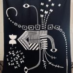
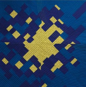
Immediately after, @mari.quilt added a different opinion: “Working on my quilt using black, white and a bit of red, didn’t seem different to me with respect to doing the same with other colors. I chose my fabric with the intention to create a composition that expressed the sense of circularity, starting from squares and letting them change shape gradually. I listened to my feelings, to decide whether I needed more white or more black while progressing on the composition, until the work was completed and titled _Circular energy_. I believe that such colors express a sense of power: black and white underline the lines, and they are colors full of strength.”
@maria_dlugosch agrees with that. She wrote: “I don’t see any difference between black and white in terms of workmanship compared to other colours.”
@annscott8888_fiber_arts explained: “I very much enjoyed making my quilt _Night Lights_ for the black and white game. Typically, I use lots of colors, so working with a black and white palette challenged me to focus solely on design elements like shape, juxtapositions, and contrast without the distraction of color. I’m a _covid quilter_, having begun my journey as an improv quilter during this pandemic, so I have lots still to learn, and this challenge stretched me in lots of new ways.”
@sakura.quilting considered the role of each graphic element involved. “Improvising with black and white will always result in something graphic and bold because of the high contrast. But by adding b&w prints, this contrast is softened. When using other colors, contrast can be soft without even including prints. So when I use b&w, the SHAPES in the composition are the most important design element. Light differences in VALUE can only be achieved by the use of prints. So that’s the reason I wanted to add prints in the poll you previously asked.”
@alsterdeeluxe focussed on two elements only: the black, and the white: “I really enjoyed improvising in black and white, I could really focus on the composition and working in such high contrast is something I like. I experimented this time with laying out the composition on a white background (my design wall), so initially I was just playing with black and black patterned pieces, and using the design wall as my _white pieces_. This allowed me to work very quickly on the composition.”
@densyendehimmel observed the impact that black and white give to the rest: “Black and white are different because they make other colors glow.”
Maria Luisa Rosatti, who pieced the top quilted by @thecultofquilt, thus participating into our game with a two-authors quilt, said: “Working in black and white gives me a sense of depth, in particular thanks to the presence of solid black, while the white parts seem popping out in the front”.
@zehralina_quilts concluded: “Working with the black and white color palette is liberty of creating. There is no absorption of creative energy in thinking about whether the colors match or not.
It was totally freedom and the focus on shapes, angles and delimitation. I could totally concentrate on the essence of the surface. Although improvisational quilting always provides me moments of surprise, sewing with black and white exponentiates this event. The reduction of the color palette expands the possibilities of structuring.”
„Angelika“ by @zehralina_quilts
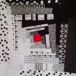
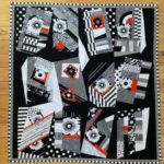
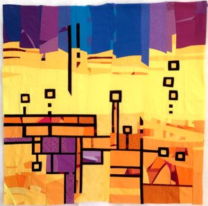
“Im-perfect love: The Four of Us” by @emmafassio
A second question was the following one: once you have finished an improv quilt, what do you look at, to analyse your result?
@emmafassio explained: “When I complete an improv work, I stop and I try to listen to the perceptions and emotions that the work suggests to me. At that moment, I check if the received feelings are in line with the message or the interpretation that I wanted to convey since the beginning.”
@mari.quilt, now, fully agrees: “When I complete my work, I look at the overall effect: is it executed well? Does it express what I had in mind? but, most of all, which are the feelings that it gives to me?”
This time, a different view comes from @maria_dlugosch: “I don’t analyse my results, I like it or not. My quilts don’t have a story, I work from my intuition, I don’t think about why I make something. I patch and quilt just for the pleasure of doing it.”
@sakura.quilting checks both design and experience done: “When I finish an improv quilt, I look at different aspects: first, if I like the overall impact and result; second, if I experienced or learnt something new by making the quilt; third, if it reminds me of something or if I can relate to something when I look at it (in other words, if it speaks to me); and fourth, if I really followed the rules that I (or someone else) imposed.
There’s another aspect that’s interesting when analyzing an improv quilt. I feel an improv quilt has more _value_ when I have made mistakes while making it. I need to be conscious if I corrected it or decided to leave it as it is. Those mistakes help me to learn.”
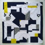
Also @alsterdeeluxe asks herself some questions about process rules: “I evaluate how closely the piece approximates my initial vision, which probably goes against all fundamentals of improvisation! I do feel like I achieved what I had in mind though: a clean, geometric inspired piece.”
@vazquezurbez makes sure that an overall check is done already before the end: “When I finish a quilt (it doesn’t matter if it’s an improv quilt or not) I look for balance, balance in the colours, in the shapes, in the whole quilt. Of course this balance has to be clear when I finish the top, before the quilting. If not, I keep working and changing things, until I get a balanced top.”
If you still don’t know what to look at, on a finished quilt, you can find plenty of suggestions in @annscott8888_fiber_arts list of checks: “I love the problem-solving aspect of quilting. I spend lots of time looking at a quilt on the design wall as it’s being constructed. These are some of the questions I ask myself – both as I’m making a quilt and after it’s completed: Is the design balanced? Are there repeated motifs that refer to each other? Does the quilt design have an internal logic? Is it cohesive? Does the scale of the design work? Where does my eye go first? Is that where I want my eye to go first? Is it pleasantly wonky or too clunky and amateurish? What design surprises are there? Have I left enough breathing room/negative space (that’s the hardest one for me)? What does the quilting add: Does it complement the piecing? Does it transform the quilt?”
For @densyendehimmel, checking her work is a jump into the future: “I always look at a finished quilt to find out if I can improve my next one.”
@zehralina_quilts agrees: “Looking at the finished work for a while, I found some very inspiring and surprising shapes, which I´d like to use in my next pieces.”
“Nightlights” by @annscott8888_fiber_arts
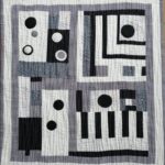
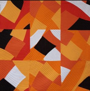
“Punk” by @densyendehimmel
The challenge is now completed. @alsterdeeluxe revealed: “The deadline pressure helped: I finished at 23:00 on the final day of the challenge!!”
During this game, some participants ventured into piecing large quilts. We thank all the quilters who appreciated our black and white prompt, such as to use it into big projects! Some of these projects are approaching completion a bit after the deadline, and are worth being checked. We mention here a few of them: @therollingcat pieced a 60” quilt (150 cm) and @susanjgrant ended up going bigger than originally planned. You can review all the work in progress from participants at the Instagram hashtag page #improvblackandwhite, and the gallery of finalists on @quiltimprovstudio profile.
Thank you all, it was a great learning opportunity, and we are already working on the next one: stay tuned!
“Transitions” by @vazquezurbez
“Crocodile chess”, pieced by Maria Luisa Rosatti, quilted by @thecultofquilt