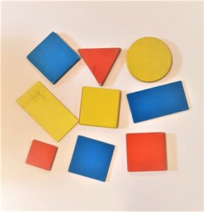
When we decided to start a game based on primary colors and black and white, we knew only part of the meanings associated with such hues.
We could not imagine how many meanings were possible and, thanks to game participants and quilting contacts, we learnt much more on the way.
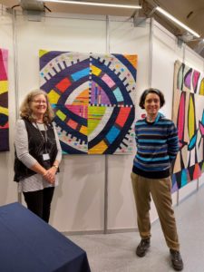
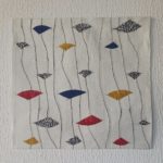
“Step it away” by @nisamckmaker
We had the pleasure of receiving comments from many quilters and also fiber artist @shinheechin wrote us, revealing a fascinating story from her culture background:
“Black and white, yellow, red and blue are famous for Mondrian’s palette, but also those five colors were called ‘obansaek’: Korean traditional colors, that are related to five elements. Blue: wood, red: fire, yellow: earth, white: metal, black: water.”
Some obvious connections and some less expected ones emerged during the game. Such as the references mentioned by our game participants below.
“Up and Down” by @morphea80
@hollygrovethreads wrote: “I improvised my two compositions based on the color requirements. I studied work by artists Piet Mondrian and also Jose Pedro Costigliolo.”
@arttextiles said: “I worked towards a mid-century look without following strictly a Mondrian influence. I chose a predominantly white background, to separate the primary colours to give them space and more impact.”
@patchbri explained: “It was since time ago that I wanted to make a quilt based on the geometries of paseo maritimo at Santa Eulalia where my daughter lives, and I found the colors perfect to realize it now.”
@quiltergardener adopted connections among colors: “I tried to group the colors into pleasing combinations to keep the quilt from looking messy. Black looked nice with yellow, blue with white. Instead of the more obvious white background I used red — and was very pleased with the result!”
“Lineplay” by @aquilterstable
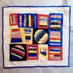
Quilt by Kim Tetzlaff @hollygrovethreads
We asked participants who finished their quilt early if they improvised the composition in some different way, due to the fact that the colors required for the game had a strong contrast.
@gigi.v13 wrote: “The requirement to use the strongly contrasting primary colors plus black and white was a true challenge for me. This is not my comfort zone and I had difficulty beginning. I finally started making borders, working from the outside, without a plan. Eventually it evolved into an improv log cabin design. I did incorporate some black Essex linen homespun, which softened the contrast and I felt more comfortable with my design.”
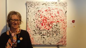
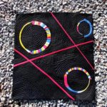
Also @therollingcat_ was not used to such hues: “At the beginning I was not sure if primary colors were available in my stash. Then, I wanted a black background to set off the primary colors. The result, with these circles having strong colors located on black and white lines, reminds me of licorice candies, hence the title”.
@auroraa1714 made a similar experience: “It was my first time using these colors… they were a little strange at the beginning, but then as I was mixing them I started to see them in a different way. Now I could do three more quilts without problems. This is one of the things that I love more of this challenge”.
@dove_ti_porta_il_filo found her way gradually: “I started piecing one color at a time, combining it with black or white. Then, after a while, I changed my route, contrasting elements found their place, and fear disappeared”.
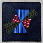
@hollygrovethreads solved the challenge using two solutions: she made two quilts! “In my first composition, I used block shapes with white as my line element. For my second composition, I used triangular shapes, with black as my line element.”
Other participants felt quite at ease: for @stitches_and_stanzas, “the strong contrast between the colors was perfect for improvising with lines because it allowed each piece to really stand out and it allowed lots of possible ways to combine pieces with a strong visual impact.” @georgene331 added: “I liked the parameter of the primary colors and lines to create the piece. I totally just let go and had a lot of free fun creating it!”
@aquilterstable gave different roles to colors, based on their value levels: “I did intentionally use white and yellow as ‘subtle’ accents, with black being used more as a background, to let the red and blue be the focus.”
“Red, Yellow and Blue” by @karen_quilts_and_makes
“Ribbons” by @georgene331
Solving color mix was part of the challenge.
But also another design feature was to be included: the line.
Thus, we asked our quilters: “The game requirement to focus on the line element acted as a constraint or as a starting point for ideas?”
@stitches_and_stanzas admitted: “I have never really explored using lines as the primary element in my quilts so I saw this as a great chance to explore and try new ways of seeing how lines could work together in a quilt”.
For @arttextiles “The lines were a ‘gift’ both in choosing the fabrics and a conscious element when constructing the smaller components within the block construction.”
@gigi.v13 added: “The requirement to focus on ‘line’ definitely created a starting point, which I found helpful. I also think it acted as a constraint for me, as I tried to limit my design mostly to lines. Other quilters seemed more or less constrained by this and maybe this can be explained by personality and experience.”
@aquilterstable started from lines too: “Line was definitely a starter point for my design. I created several striped slabs before ever knowing how I would eventually use them.”
@karen_quilts_and_makes confirmed: “My starting point was the long red check line in the middle. This became a long rectangle within a rectangle. I liked this shape, colour, contrast and effect and decided to continue in this vein using all five colours in equal measure.”
@dove_ti_porta_il_filo said “I like lines. Constraints may act as stimuli to initiate a work”.
So, has anybody found lines as a constraint too strong? “No, the line element requirement was not a constraint for me. I prefer to create lines in patchwork, find them, and follow them where they lead me!”, insisted @quiltergardener.
Moreover, @morphea80 explained how the line was helpful for her: “I wanted to soften the hard contrast of the primary colors. Therefore I went for lots of white and a curvy quilting design. To me, the required element ‘line’ was a highly welcome antidote to the bold colors.”
And if lines are difficult to match, you still can find some solution, as @therollingcat_ said: “The pesky line that I hated at the beginning became literally the connection and the starting point for the whole quilt: only when I knew how to deal with the line did I find inspiration to get started!”
@NisaMckMaker explained how lines and stripes were at the core of her process: “I randomly cut strips of differing thicknesses and used paper to stabilize them as some were very narrow. The theme of lines acted as the starting point and continued to inspire me, driving my ideas forward moment by moment”.
@hollygrovethreads made prominent use of lines: “The use of lines was an inspiration for me. Not a challenge or a constraint. This encouraged me to explore the use of lines. I enjoyed studying different methods of inserting skinny strips into a composition. I’ll certainly incorporate this in future work”. This resulted in her “Mod Mondrian” quilt made for the current game to be selected to hang at Quiltfest Greenville SC, April 28-30. Congratulations Kim!
“Licorice candy” by @therollingcat_
We extend congratulations also to other quilters who had their works, created in the occasion of earlier @quiltimprovstudio games, selected for QuiltCon2022 and aired last February in Phoenix, Arizona, such as @aquilterstable, @quiltcreation and @kathycookquilts; while @sakuraquilting was awarded at Gramado Brasil quilt festival with her quilt created during our first challenge (an early bird player, we may say!). We are learning from each other. We are honored by the attention you dedicate to exploring improvisational constructions, using design principles shared with us… with great results!
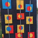
“Ketchup & Mustard” by @quiltergardener
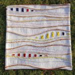
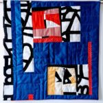
“Back to school” by @dove_ti_porta_il_filo
We wish to thank all our game participants, so active within a thriving quilting community we humbly try to contribute to: merit to you, for all the great fun during our games! We invite you to review all work in progress at #qisprimarycolors Instagram page, and the improv quilts completed by the participants in the @quiltimprovstudio gallery.
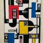
“Mod Mondrian” by @hollygrovethreads
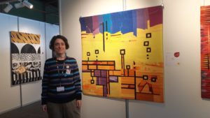
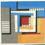
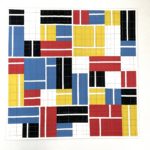
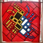
“Mini-Munchman’s Amusement Arcade” by @arttextiles