Our last improv game, Monochrome dreams, is finished. Every quilter was free to choose the single color to play with, thus, the gallery of the quilts made by game participants reflects a variety of color preferences, and it reminds us of a rainbow!
For the next improv game, on the contrary, we are preparing for the pleasure of sharing the same palette of colors for all of us, leaving open the composition features: it will be defined by a poll open to participants, whether to pick a common design element, or leave all of the composition parameters free.
The first hint for a palette choice was given by Carla: she proposed the primary colors, red, yellow and blue, and we, Giovanna and Paola, added the black and white. We also wondered whether to use a common design element (and this decision will be up to you: follow @quiltimprovstudio Instagram stories, and you will find related polls in the next few days).
Step after step, some clearly recognizable elements adjoin each other: this five color receipt makes us think of the artist Piet Mondriaan; don’t you see him too, when talking of such colors? Said this, sure we are not looking for a too homogeneous gallery, with Mondriaan as the sole inspiration source. Indeed we asked ourselves: “Where else do we find this combination of colors?”
Here you will find our replies.
Giovanna is a kindergarten teacher, she is surrounded by primary colors everyday. She uses primary colors mixing them while teaching how to get secondary colors; she finds primary colors again when the dialogue with children opens up the topic of our inner emotions (yellow, red and blue may be connected respectively with joy, anger and sadness). She observes and handles the pieces used to explain logic and geometry. Many children’s books make wide use of primary colors, for example those created by French author Hervé Tullet who guides through the pages children activities and laboratories on creativity.
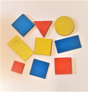
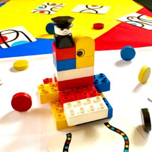
Carla has been a math teacher, and on the mathematics book covers she’s often found images of Mondriaan books: such figures were used to explore concepts of parallelism and orthogonality. Primary colors and black and white are also used in home decor design objects. Today, Carla is a full time grandmother, and with her nephews she uses toys where primary colors prevail, because they have strong visual impact and they are easily recognizable by pre-school kids. A typical example is found in Lego bricks: they stimulate children’s fantasy and construction skills. Another examples are play dough and kinetic sand: they can be mixed, and lead to the discovery of secondary colors. At that age, each exploration can lead to surprise!
Paola opened her memory box, and recalled artists admired during the travel in France, at Fondation Maeght, which hosts a wide permanent collection of painting, sculpture, drawing and graphic art of the twentieth century: in that period, primary colors and black and white were used a lot, for their strong graphic result. She also thought of Bauhaus school, which found in the realm of design a connection point between art and production, and explored visual communication through symbols, such as in the exercises where color and shapes were associated: yellow triangle, red square, blue circle.
Before launching this game, we have searched for works inspired by Mondriaan style, that could be interesting for you, such as the quilt by Jackie @tinwoman48 . Let us know if you find more of them, and start planning your “Beyond Mondriaan” quilt!
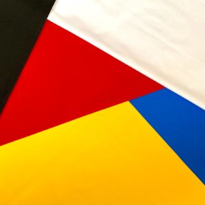
Now we invite you to explore your surroundings in the next few days, checking where this five colors combination appears. You may decide to use your real experience with primary colors as your inspiration source, or let creativity flow in an improvisational process and let the result bring you in unexpected territories. We can be sure that such a creation will be uniquely yours, carrying strong visual effects!
Enjoy! Carla, Giovanna and Paola
 English
  Italian